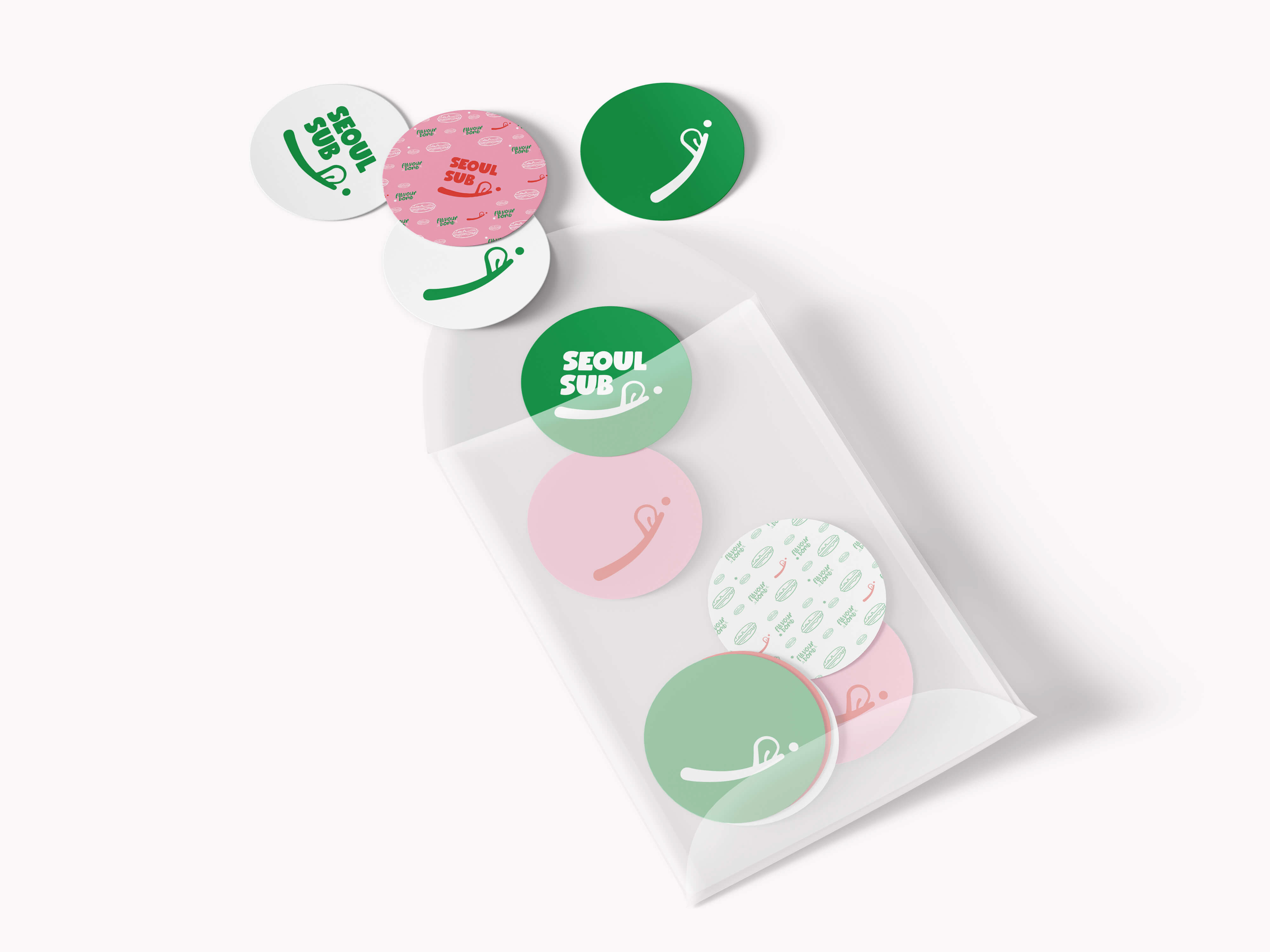
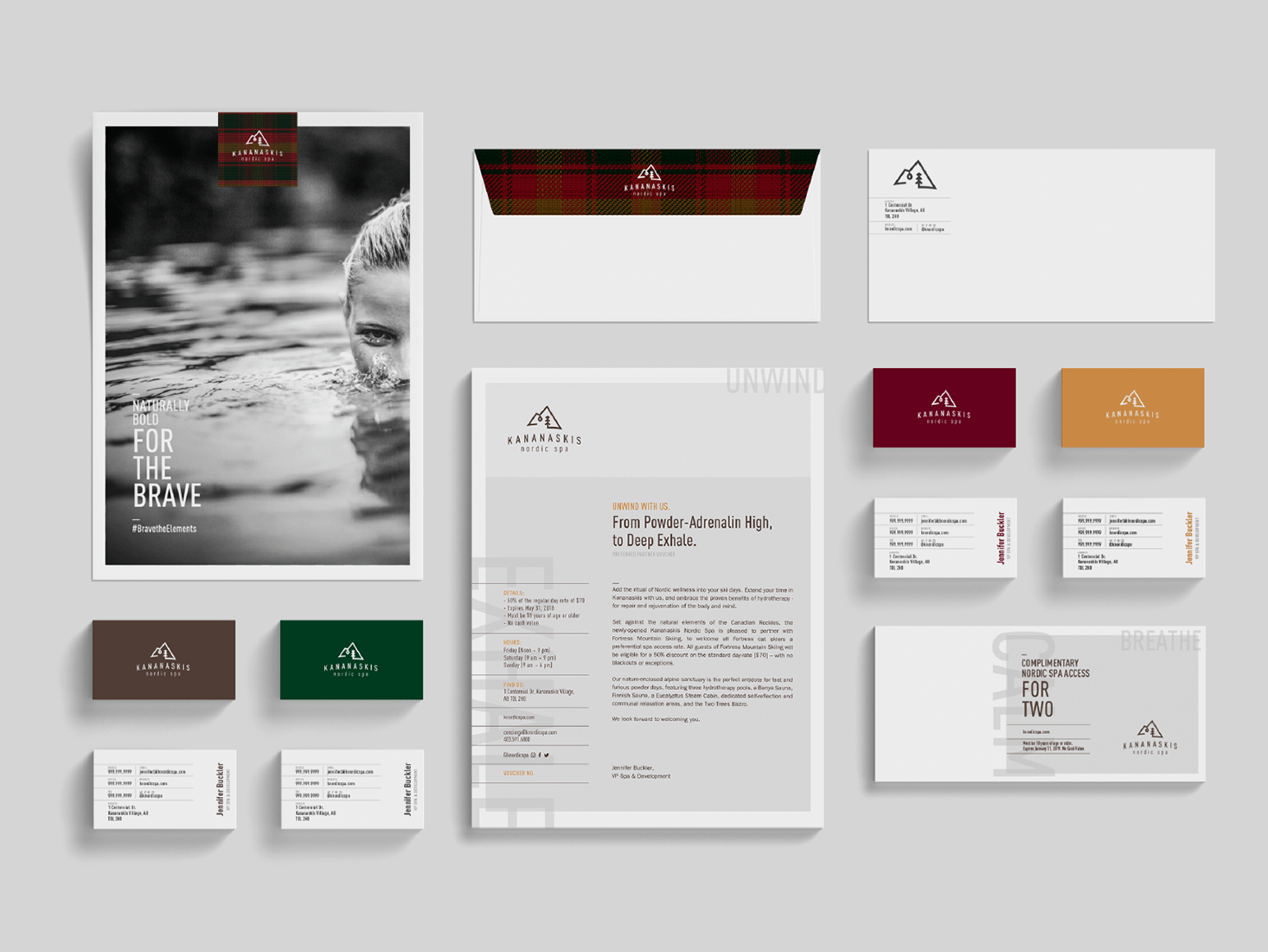
Takori, an asian fusion taqueria by renowned chef Duncan Ly. What Takori offers is accessible. Takori customers can choose from taco trios with fillings like bulgogi beef brisket and pork belly with kimchi, giving them a chance to try chef Ly’s food without having to pay full-service restaurant prices.
DIRECTION ONE: In creating a memorable logo, timelessness in the look and feel needs to be apparent. With the first direction of the logo, an earnest and more established approach was taken. Inspiration was taken from asian elements: double happiness character (a symbol of marriage) and korean characters to create something similar to an asian stamp. The lines in the box make up letters spelling T.A.K.O.R.I. The "marriage" of asian characters with the western alphabet make for a sturdy, unique and innovative logo which coincides with the Takori brand - asian flavors with a canadian flare. And is also indicative of Chef Duncan's background (born in Vietnam, grew up and trained in Canada).
DIRECTION TWO: Combining elements from the taco, Korean flag and Vietnamese flag, a playful approach was taken to create an asian street food look and feel. This logo direction speaks directly to the audience which are young adults and family that is looking for a great and quick meal. The ever recognizable graphic of a taco makes it approachable and to an extent relatable to the audience and quickly communicates a "fast meal".
