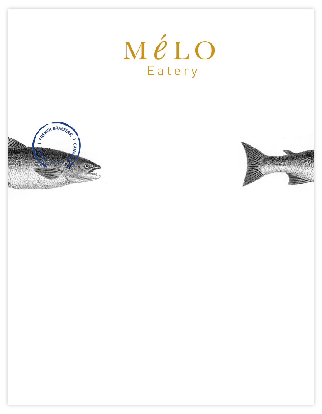
Mélo is the Podge to the Hodgepodge of Méli Mélo. Meaning a mixture or mishmash. Using typography as a literal representation of mishmash, the M, L, O in a regular serif font and the “é” in lowercase italics make for a dynamic logo. The “é” also stands out from the rest of the letters which subliminally says that Mélo is different and distinctive and stands out from its competitors.
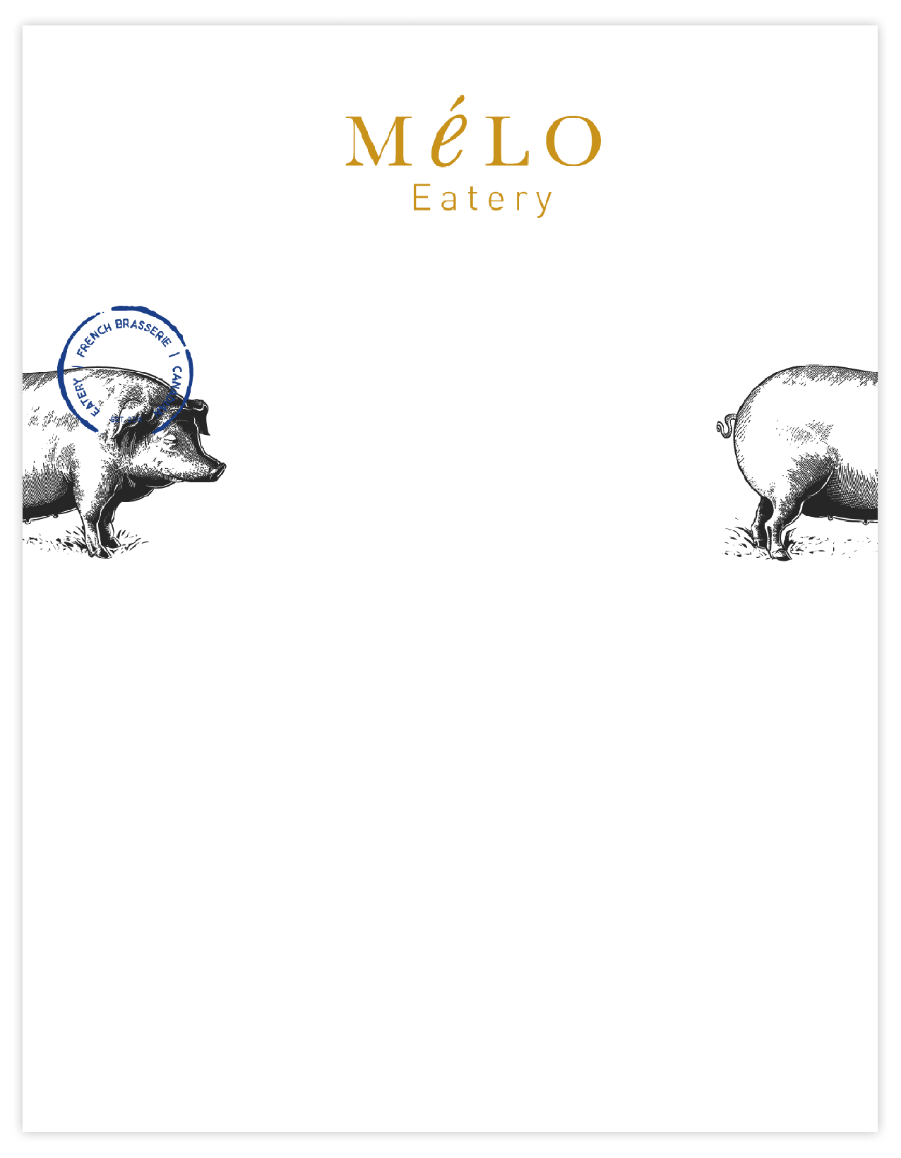
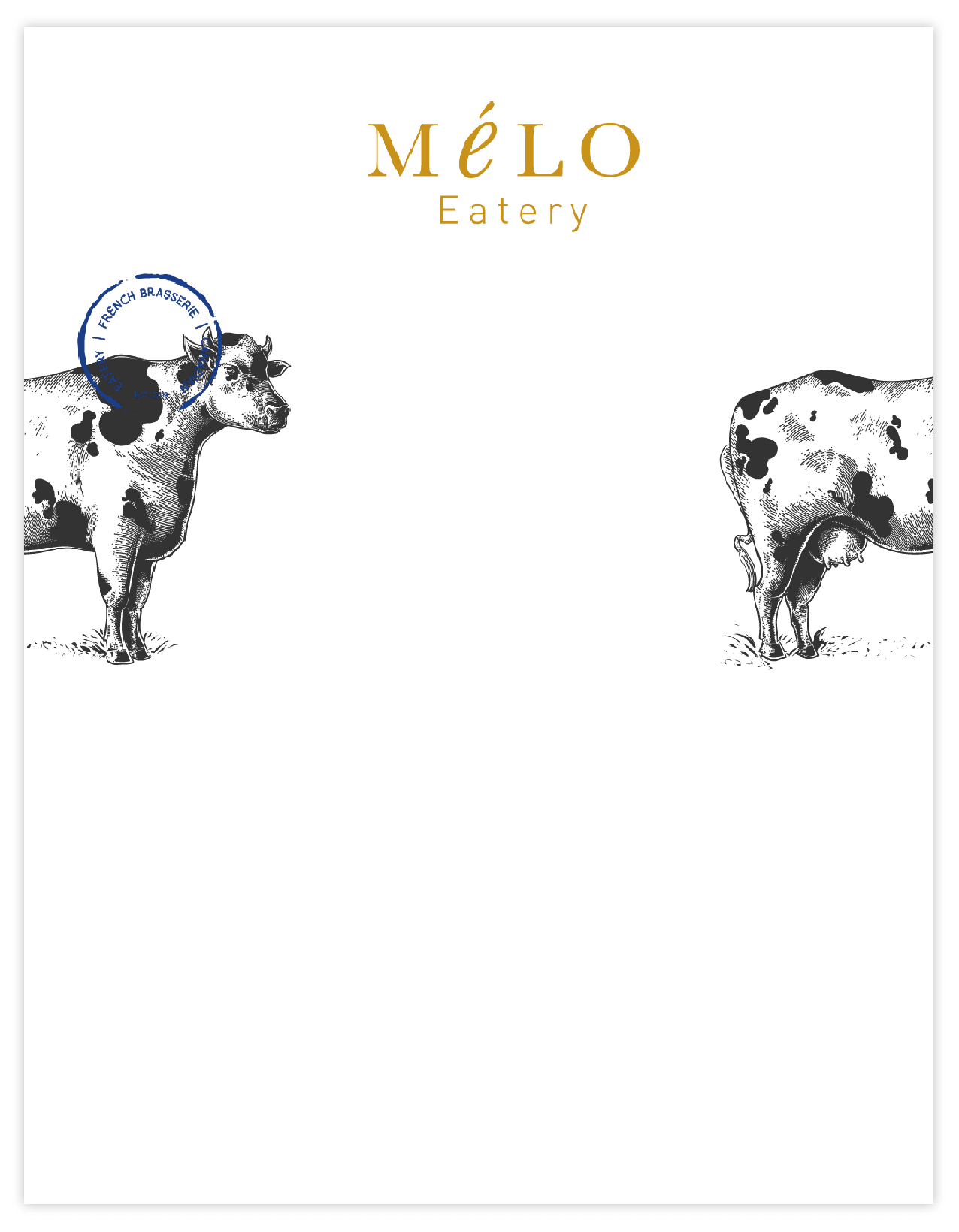
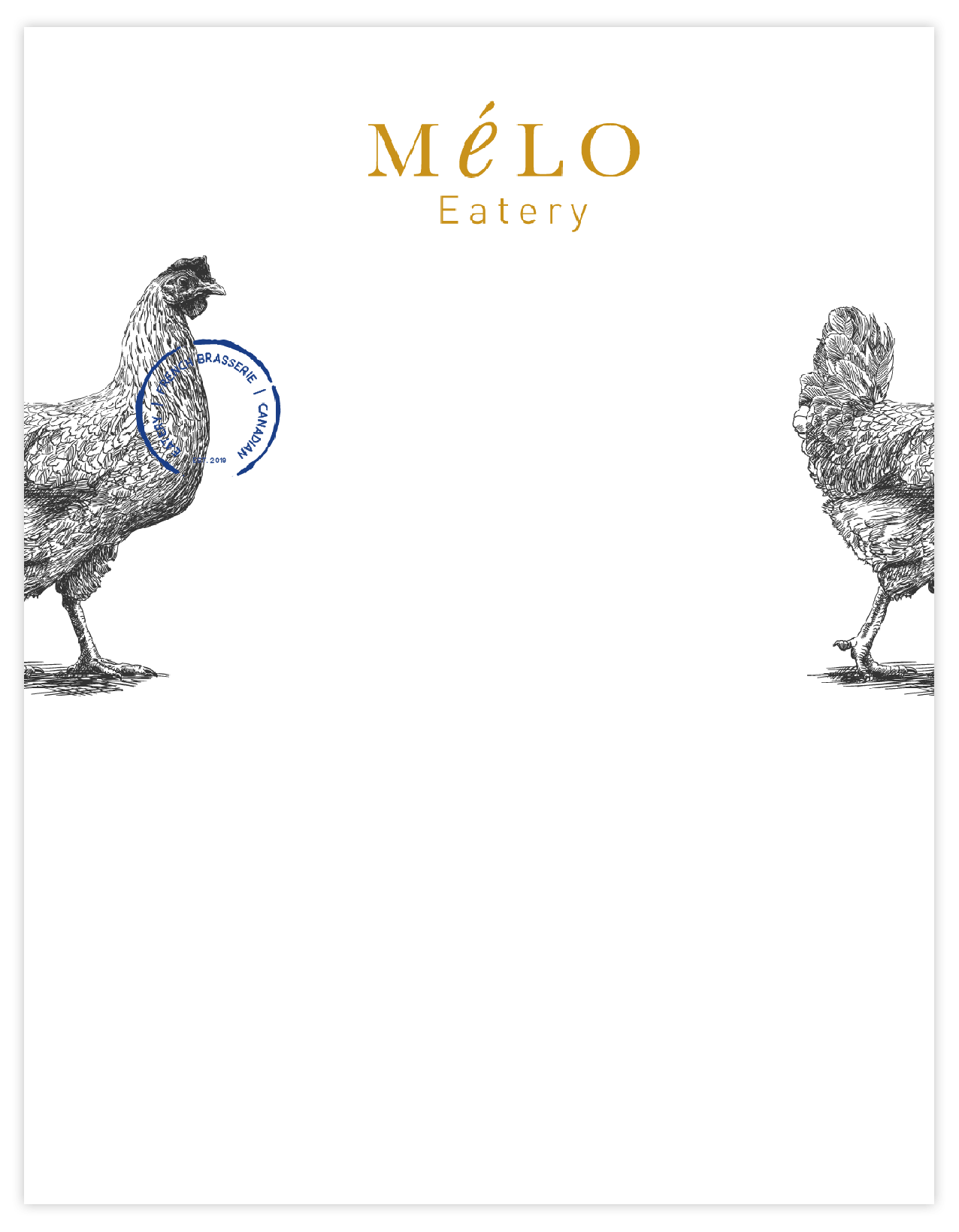
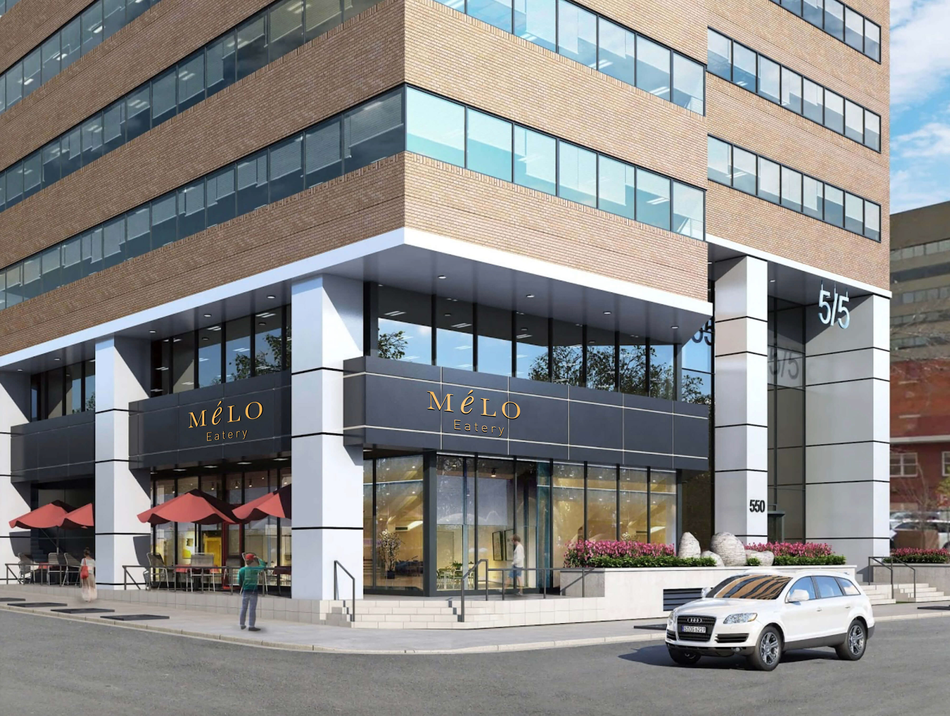
The mustard yellow is the primary color for the identity. It was extracted from the colors of the interior wooden bar. In addition, to add some “pop” and swank, the yellow can be replaced with gold foil. Example the exterior sign can be in gold, so that the color will not appear flat. The accompanying graphics will be etched illustrations of a pig, cow, chicken and fish. Indicating that Mélo is a food establishment. The graphic of each animal will show the first half of the body on the left hand side and the second half of the body on the right hand side of any given print piece ... this speaks to the notion of “nose to tail cooking”. These illustrations will add to the overall look and feel and can lend to a captivating design element.